Solways

Full redesign of a tourism platform spanning 9 business verticals — travel agency, hotels, transfers, flights, experiences, packages, insurance, conferences, and a Premium VIP section.

9 verticals

of business covered in the design

8 phases

of documented UX/UI process

2 brands

base Design System + Premium VIP

MCP + Cursor

Design System linked to development with AI

My role on the project

UX Lead
IxD (Interaction Design)
UX QA
Design System
UI Design

I was the sole person responsible for UX/UI on this project, from information architecture through to overseeing interaction design and quality assurance from the user's perspective. Unlike other projects, here the team fully trusted my judgment and gave me near-total freedom to lead my area and drive product decisions.

Why this is the most complete case in the portfolio

No other project in this portfolio brings together, in one place: documented Scrum project management, research through surveys and benchmarking, five types of architecture maps, an A/B test with a Figma prototype moderated from an iPhone, a Design System with original illustrations and a defined tone of voice, an MCP integration with Cursor, and pattern playbooks built in NotebookLM. This is the case that shows a digital product can be carried end-to-end with senior-level product judgment.

The Problem

Solways Cuba is a travel agency with one of the broadest offerings in the Cuban tourism market: hotels, transfers, domestic flights, experiences, packages, insurance, conferences, and a Premium VIP line. Its existing digital product suffered from the same systemic problems affecting most tourism platforms in the region: poor information architecture, confusing navigation, no defined conversion flows, and a visual identity that didn't match the scale of the business.

The challenge wasn't just redesigning screens — it was transforming a fragmented product into a cohesive, scalable sales platform capable of supporting nine business verticals with differentiated experiences, including a premium brand with its own identity.

Scope of the designed product

Business verticals

  • Travel agency

  • Hotels & accommodations

  • Transfers

  • Experiences

  • Travel packages

  • Travel insurance

  • Conferences

  • Premium VIP section

Additional modules designed

  • Help center

  • About Solways

  • Travel agent portal

  • Login & registration

  • Traveler profile

  • Agent profile with benefits

  • Solways Premium

  • Rooms with imagery

Process — 8 documented phases

01.

Project management — Scrum in Notion with integrated UX QA

Before designing a single screen, I set up the entire project in Notion using Scrum methodology: planned sprints, a detailed roadmap, and a fixes-and-issues table that served as an active UX QA system throughout the process. The roadmap was planned and delivered with only a one-month deviation on a project of this scale. This phase proved that design isn't just a visual discipline — it's a management discipline.

01.

Project management — Scrum in Notion with integrated UX QA

Before designing a single screen, I set up the entire project in Notion using Scrum methodology: planned sprints, a detailed roadmap, and a fixes-and-issues table that served as an active UX QA system throughout the process. The roadmap was planned and delivered with only a one-month deviation on a project of this scale. This phase proved that design isn't just a visual discipline — it's a management discipline.

Notion
Scrum
Sprints
Roadmap
Sprints
QA-UX tracking

02.

Research — empathy grounded in known context

Although UX research phases weren't formally contracted, I applied what I could: a competitive map to understand positioning against other tourism platforms, and a survey that, despite limited results, helped structure and validate what I already knew about the client. Deep knowledge of the business became documented hypotheses — not unexamined intuition.

02.

Research — empathy grounded in known context

Although UX research phases weren't formally contracted, I applied what I could: a competitive map to understand positioning against other tourism platforms, and a survey that, despite limited results, helped structure and validate what I already knew about the client. Deep knowledge of the business became documented hypotheses — not unexamined intuition.

Competitive analysis
Survey
Benchmarking

03.

Information architecture — five maps for a complex product

This was the most critical phase of the project. I started by mapping the current product with precision — a mental model of the real state that revealed deep organizational and navigational problems. From that diagnosis, I designed a new proposed mental model aligned with business goals without straying from them. I then developed a conceptual map built with the team, a content hierarchy map, and an additional conceptual map exclusively for Experiences, given its specific complexity. Five maps, five levels of understanding of the same product.

03.

Information architecture — five maps for a complex product

This was the most critical phase of the project. I started by mapping the current product with precision — a mental model of the real state that revealed deep organizational and navigational problems. From that diagnosis, I designed a new proposed mental model aligned with business goals without straying from them. I then developed a conceptual map built with the team, a content hierarchy map, and an additional conceptual map exclusively for Experiences, given its specific complexity. Five maps, five levels of understanding of the same product.

Mental Map
Concept map
Hierarchy map

04.

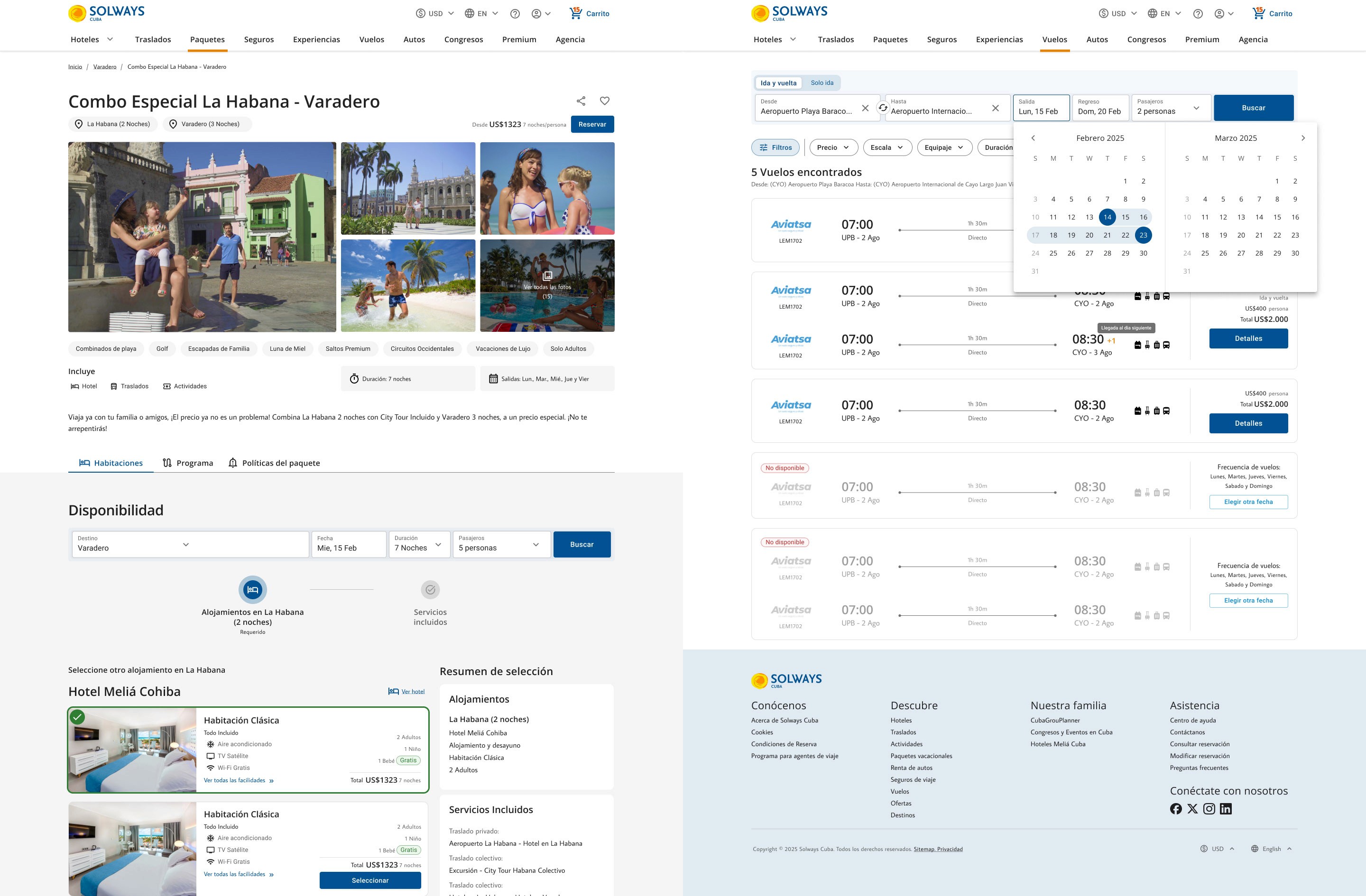
Wireframes, A/B testing, and user flows — validation before UI

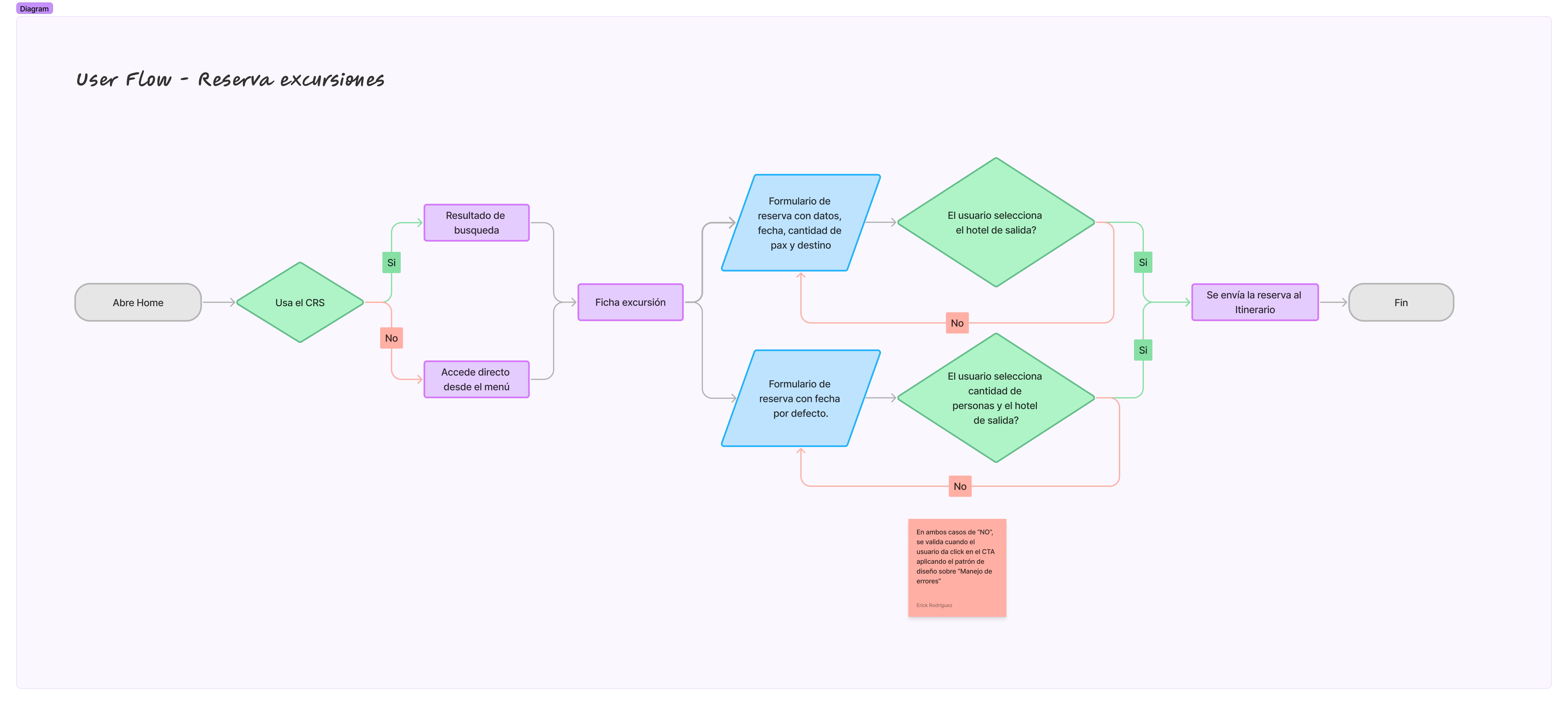
I designed medium-fidelity wireframes for the entire product: all nine verticals, the shopping cart, the help center, login, registration, and profiles for two user roles. For the first time in this portfolio, I built interactive prototypes in Figma and ran A/B tests that I moderated myself, directly from my iPhone. Results in the room-selection flow were decisive — we identified drop-off points that weren't visible in static wireframes, and resolved them before moving into UI. I also designed dedicated user flows for Experiences, whose booking logic demanded its own level of detail.

04.

Wireframes, A/B testing, and user flows — validation before UI

I designed medium-fidelity wireframes for the entire product: all nine verticals, the shopping cart, the help center, login, registration, and profiles for two user roles. For the first time in this portfolio, I built interactive prototypes in Figma and ran A/B tests that I moderated myself, directly from my iPhone. Results in the room-selection flow were decisive — we identified drop-off points that weren't visible in static wireframes, and resolved them before moving into UI. I also designed dedicated user flows for Experiences, whose booking logic demanded its own level of detail.

A/B test result

The tests revealed critical drop-off points in the room-selection flow that weren't detectable in static wireframes. The iterations made before moving into UI eliminated these issues before they reached production — saving development time and design rework.

Medium-fidelity wireframes
User flow
Medium-fidelity wireframes
Figma mobile testing

05.

Design System — from Material UI to a system with soul

I started from a paid Material UI kit and transformed it into a complete Design System with eight sections. For the first time in my practice, I defined the product's tone of voice — the communication personality that turns a platform into a brand with its own character. Illustrations were originally designed in Adobe Illustrator, with the system's colors defined as variables to ensure consistency and adaptability to future changes under accessibility criteria. For design patterns, I built notebooks in NotebookLM fed with sources such as NN/g, Google, IBM, and Microsoft, and shared them with the whole team to democratize access to best practices without depending on a single person.

05.

Design System — from Material UI to a system with soul

I started from a paid Material UI kit and transformed it into a complete Design System with eight sections. For the first time in my practice, I defined the product's tone of voice — the communication personality that turns a platform into a brand with its own character. Illustrations were originally designed in Adobe Illustrator, with the system's colors defined as variables to ensure consistency and adaptability to future changes under accessibility criteria. For design patterns, I built notebooks in NotebookLM fed with sources such as NN/g, Google, IBM, and Microsoft, and shared them with the whole team to democratize access to best practices without depending on a single person.

NotebookLM as a team tool — a product decision

In teams with low UX maturity, best practices go unused simply because no one knows where to find them. By giving the team conversational access to NN/g, Google, and IBM, that knowledge stopped depending on one person and became team infrastructure.

Material UI → Design System
Style guide
CRS components
Transfer cards
CRS components
Original illustrations
Tone of voice
Tone of voice
Original illustrations
Design patterns using Google NotebookLM

06.

Development integration — Design System linked via MCP to Cursor

With all variables defined in Figma, I linked the Design System to the development environment via MCP connected to Cursor. The development team wasn't expecting it. This integration meant design tokens were available directly inside the code environment, eliminating the interpretation gap between design and implementation. It was the most strategic use of AI in the entire project.

06.

Development integration — Design System linked via MCP to Cursor

With all variables defined in Figma, I linked the Design System to the development environment via MCP connected to Cursor. The development team wasn't expecting it. This integration meant design tokens were available directly inside the code environment, eliminating the interpretation gap between design and implementation. It was the most strategic use of AI in the entire project.

Figma variables
MCP
Design tokens
Cursor
AI-assisted handoff
Design tokens

07.

Final UI — designed, documented, and tested before production

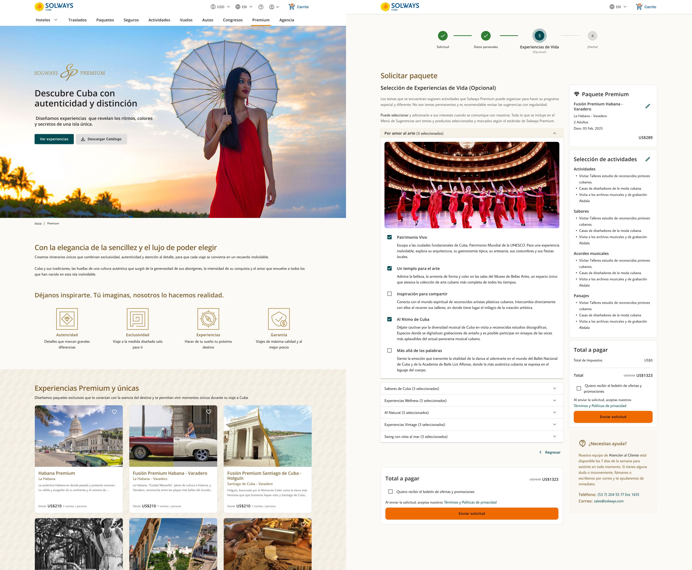
With the full foundation validated, I began UI design for the entire product: every screen accompanied by documentation, category-specific notes, and fully detailed wireflows. Sections at the highest risk of drop-off were tested with simple usability tests that I moderated myself before moving to production. The Premium VIP section required additional work: adapting the Design System to a second brand with its own visual identity — distinct colors, typography, and components. The project remains in the UI phase, with me still active in the UX QA role.

07.

Final UI — designed, documented, and tested before production

With the full foundation validated, I began UI design for the entire product: every screen accompanied by documentation, category-specific notes, and fully detailed wireflows. Sections at the highest risk of drop-off were tested with simple usability tests that I moderated myself before moving to production. The Premium VIP section required additional work: adapting the Design System to a second brand with its own visual identity — distinct colors, typography, and components. The project remains in the UI phase, with me still active in the UX QA role.

UI
Documented wireflows
Moderated usability testing
Prototype
Active UX QA

Premium VIP system
Responsive design

08.

Next steps — heuristic audit and unmoderated testing

Once UI is complete, the plan is to run unmoderated usability tests to detect friction in real flows without a facilitator present, followed by a professional heuristic audit based on Nielsen's principles. The goal is to deliver a product that is not just well designed, but audited and validated before launch — an uncommon practice that ensures future scalability.

08.

Next steps — heuristic audit and unmoderated testing

Once UI is complete, the plan is to run unmoderated usability tests to detect friction in real flows without a facilitator present, followed by a professional heuristic audit based on Nielsen's principles. The goal is to deliver a product that is not just well designed, but audited and validated before launch — an uncommon practice that ensures future scalability.

Unmoderated usability testing
Heuristic audit
Pre-launch QA
Original illustrations

UX QA — overseeing implementation

Beyond design, I took on the UX QA role during implementation: verifying that developed components respected the documented patterns, that interaction flows matched the approved designs, and that the final in-browser experience stayed true to the design intent. This role is uncommon in teams with a low UX maturity level — and it's what ensured the design work didn't get lost in implementation.

Before vs. after

This before/after isn't just aesthetic — it's the result of a business transformation. The previous platform couldn't sell. The new one was designed, from the very first mental model, to convert visits into bookings.

Solways Cuba - Before

Solways Cuba - After

What this project demonstrates

That I can carry a highly complex digital product from end to end with senior designer judgment and a product mindset. That I manage projects, not just screens — Scrum, roadmap, sprints, and integrated UX QA from day one. That I build real design systems, with tone of voice, original illustrations, and documented accessibility. That I understand the modern delivery pipeline: Figma, variables, MCP, Cursor. That AI doesn't scare me — I used it to scale the team's work and democratize access to best practices. And that every design decision in this project has a documented, validated, or tested rationale behind it before reaching production.

Feb 2024

Inicio del proyecto · en curso hacia lanzamiento.

4 roles

UX · UI · IxD supervisor · QA-UX

Prime Vue → DS

UIKit extendido hasta Design System propio

Libertad total

Decisiones de diseño y producto 100% propias

I treat every project I take on as if it were my own. This means tough decisions, rigorous design criteria, and improvements you'll see in your product, your conversions, and your team's workflow. If this sounds like what you're looking for, let's talk.

© All rights reserved 2026 – Erick Rodriguez

I treat every project I take on as if it were my own. This means tough decisions, rigorous design criteria, and improvements you'll see in your product, your conversions, and your team's workflow. If this sounds like what you're looking for, let's talk.

© All rights reserved 2026 – Erick Rodriguez

I treat every project I take on as if it were my own. This means tough decisions, rigorous design criteria, and improvements you'll see in your product, your conversions, and your team's workflow. If this sounds like what you're looking for, let's talk.

© All rights reserved 2026 – Erick Rodriguez